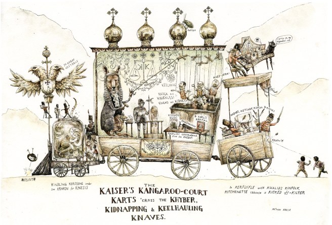
 I used to hate alliteration. I thought, just because it’s simple, it was a lesser form of wordplay. Not so! When done well, alliteration can make a sentence sing; it can make words pop off the page and make music out of their syllables (these are bad examples, but it’s almost impossible not to get carried away. You try writing about writing, and see what happens).
There are plenty of authors that have made me change my mind, but more recently, io9 showcased the work of Nathan O. Marsh’s series Alphabet Apocrypha. For every letter, Marsh creates intricate illustrations following a set theme. Some are simple—m is maps, j is the jumping jackalope—but others are far more complicated. A few are almost a storybook unto themselves. As a whole, the project is very reminiscent of Edward Gorey, from the twisty, spindly little sketches to the alphabetical material. There’s also a touch of Hieronymus Bosch and a hint of M.C. Escher—which, now that I think about it, isn’t a bad way to describe either Gorey or Marsh.
So far, Nathan has made it to letter Q. He’s posting new illustrations all the time, which are only getting better as he gets further along. Naturally, I really like the entry for K (though L is truly my favorite).
