Myriam Dion is destroying print media.

anthology-mag-blog-Cut-Paper-by-Myriam-Dion-2As much as it pains me to admit this, I know, at some point in my life, I said the phrase “print media is dead.” It was probably when I was fresh out of college and working exclusively online and intoxicated by the sweet poetry of HTML and distracted by the truly catholic offerings of my most beloved blogs. I probably thought I was just being practical. I probably thought I was right (because I usually do think that, sometimes even for far longer than I honestly should).

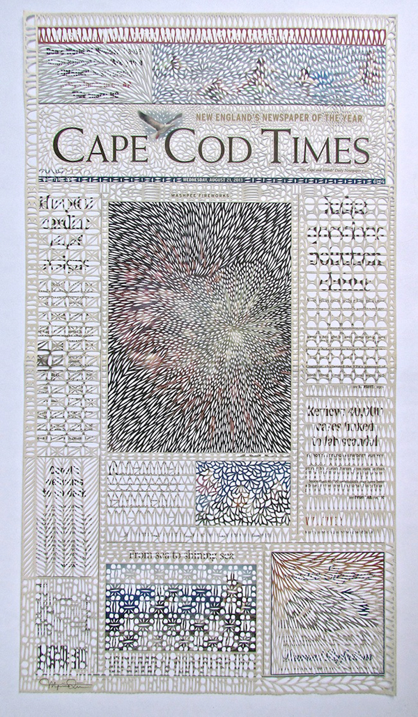
But print is not dead! Print is alive and wonderful and fun, and learning about things like page bleed and grammage has been surprisingly fascinating. Paper is a cool thing, in and of itself, but Myriam Dion makes it extra, excruciatingly cool. This Canadian artist turns newsprint into art, thus destroying the original object’s functionality while creating something that is far more beautiful than the paper itself. And she does this by cutting, slicing, and peeling out slivers of the pulpy-soft weave. With Dion’s pieces, print is both alive and dead. And I love it.

See more at Anthology Mag.
Turning paper into water.

Screen shot 2013-04-23 at 8.41.09 PM
Paper is amazing. It’s an amazing material. Think about it. Until we had screens, we needed paper to transmit our information. It is the surface on which people write great novels, scribble sappy love notes, paint touristy scenes, and jot down ever-vague notes-to-self (I am particularly guilty of this last one). Paper is also one of my favorite materials when it comes to creating art. Cut paper pieces are simply gorgeous, and the shapes that can be made from plain cardstock never cease to blow my mind. I could write an ode to paper—a careless person might say that I am, right now, composing an ode to paper, but nope, it’s not a poem so it’s not an ode, okay?—but I think it’s better to just show you what can be done.

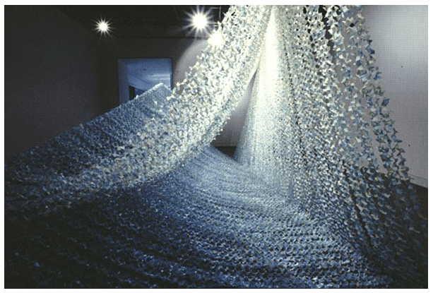
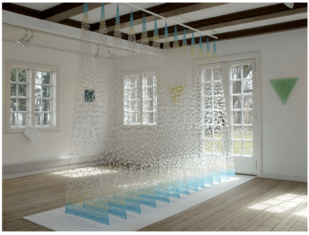
This is what Yuko Takada Keller does with cut paper. She takes these little shreds and turns them into flowing water, cascading light. In her installations, paper denies the laws of physics and takes on any form it pleases (air, water, even fire). The many little pieces work to form something greater, something that breathes motion and mutability.

And, thanks to her eye for color, they’re also just so peaceful to look at. Light greens and clear blues. In an artist statement, she said “I hoped my works would remind the viewer of something pure and natural in this world,” and oh, it does.
Screen shot 2013-04-23 at 8.42.15 PMScreen shot 2013-04-23 at 8.41.35 PM
More here. Found via Pinterest.

Flying so close to the sun.

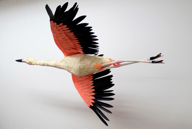
featered friendSometimes I think I’m pretty crafty, and then I see work like Diana Beltran Herrera’s and I realize I have a long, LONG way to go. I can make paper flowers, but she makes paper fly. Her gorgeous series of paper birds can be seen in full on Flickr, but I first found it on the excellent site Colossal. It’s truly amazing what someone can do with colored paper and a little bit of glue. I’m jealous.

lovelylittlebirdsSee more here.

Papercuts for The Bard.

romeoandjuliet_kevinstanton9Some people say that print is dead, but I’m not buying it—probably because I am buying books, and so are plenty of other bibliophiles. However, I do think publishing is changing, and one way I can see it adapting to the digitization of the writer word is through making books that aren’t disposable, that aren’t simply a collection of characters, but rather objects worth owning (and collecting). Plenty of publishers, both the big guys and the indie players, are releasing special edition copies of the classics that are straight up gorgeous. I’ve written about my adoration for the Barnes & Noble collaboration with typographer and artist Jessica Hische a few times before (enough that my mom took note, and bought me a box set for Christmas last year), but today I came across a new object of literary lust: Sterling Publishing’s Shakespeare collection, as illustrated by papercutting genius Kevin Stanton.

hamlet papercutJust look at Ophelia! It’s lovely and bold and sharp and fluid all at once. From what I can tell, the books have different color palates, from Hamlet‘s dramatic navy and red to the vibrant yellows of Much Ado About Nothing. If funds weren’t an issue, I would buy them all right now—especially Hamlet, because I’ve always had a soft spot for that faker.

Stanton_MA9Check out more of Stanton’s work here.

Two Nice Things.

1. I’ve expressed before my love for Roald Dahl. As a kid, I always loved his children’s books, but it wasn’t until I was older that I really started appreciating his amazing sense of humor. His stories for adults are darkly hilarious, and his memoirs walk the line easily between making light of minor horrors (like being caned at the hands of a sadistic school master) to expressing real excitement and sorrow at huge life changes (including the death of a family member and his very first—very exotic—job overseas). The guy lives a fascinating life.

Anyway, I’m loving these papercuts by artist Jayme McGowan. Featured on the Etsy Blog, they’re such a whimsical tribute to the author. My favorite? The misunderstood bookworm Matilda, of course.

Continue reading