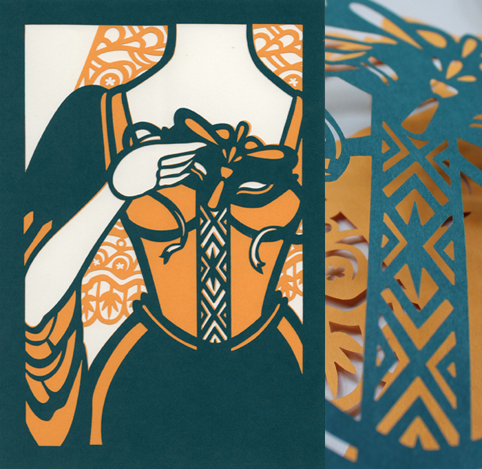
 Some people say that print is dead, but I’m not buying it—probably because I am buying books, and so are plenty of other bibliophiles. However, I do think publishing is changing, and one way I can see it adapting to the digitization of the writer word is through making books that aren’t disposable, that aren’t simply a collection of characters, but rather objects worth owning (and collecting). Plenty of publishers, both the big guys and the indie players, are releasing special edition copies of the classics that are straight up gorgeous. I’ve written about my adoration for the Barnes & Noble collaboration with typographer and artist Jessica Hische a few times before (enough that my mom took note, and bought me a box set for Christmas last year), but today I came across a new object of literary lust: Sterling Publishing’s Shakespeare collection, as illustrated by papercutting genius Kevin Stanton.
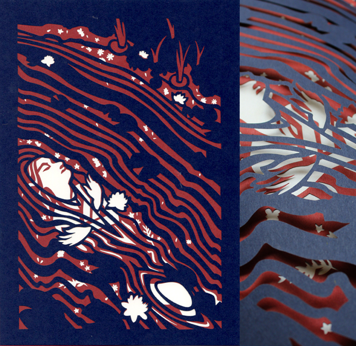 Just look at Ophelia! It’s lovely and bold and sharp and fluid all at once. From what I can tell, the books have different color palates, from Hamlet‘s dramatic navy and red to the vibrant yellows of Much Ado About Nothing. If funds weren’t an issue, I would buy them all right now—especially Hamlet, because I’ve always had a soft spot for that faker.
 Check out more of Stanton’s work here.

Thank you so much for the wonderful write-up! I hope that you do get all four books at some point (and let me know what you think)!